
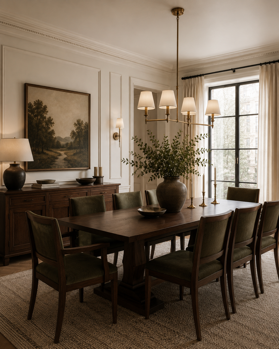
Color changes more than the appearance of a room. It can influence energy, focus, comfort, appetite, and even the way we perceive scale and temperature. Yet color psychology in interior design is not a rigid formula. The same green may feel restorative to one person and deeply nostalgic to another; a dramatic red may energize a dining room but feel overstimulating in a bedroom.
A successful palette begins with the atmosphere you want to create, then considers architecture, daylight, materials, and personal association. Color is most powerful when it supports how a room is used and gives meaningful objects, art, and furnishings a coherent setting.
Warm and Cool Tones Shape the Mood
Warm colors such as red, rust, ochre, coral, and gold tend to advance visually, making a room feel energetic, intimate, and enveloping. They can work beautifully in dining rooms, entertaining spaces, libraries, and other areas designed for conversation or activity.
Cool colors—including blue, green, and violet—often feel calmer and more expansive. They are natural choices for bedrooms, bathrooms, and quiet workspaces, though saturation changes the effect: deep navy can feel cocooning, while pale blue may feel airy. Most rooms benefit from balance, such as warm wood and brass within a cooler palette.
Use Accent Colors with Intention
Accent color gives a room rhythm and personality without requiring every permanent finish to make the same statement. Artwork, an upholstered chair, painted millwork, a bold wall, or a group of accessories can introduce color at different scales.
Repeat the accent selectively so it feels connected rather than accidental. A tone in a painting might reappear in a textile or small object, while quieter related shades create depth. The strongest accents draw attention to something worth noticing—architecture, art, a view, or a meaningful piece.
Let Seasonal Color Inspire Flexible Layers
Seasonal shifts can refresh a home without prompting a complete redesign. Spring may suggest softened greens, lilac, or pale blue; summer can support clearer, more vibrant accents; autumn brings rust, olive, and earthen tones; winter often invites deeper shades and warmer neutrals.
Use the seasons as inspiration rather than a rule. Textiles, flowers, branches, table linens, and decorative objects are easy to rotate, while walls, cabinetry, and major upholstery should be selected for a longer horizon. A stable foundation makes these smaller changes feel natural.
Lighting and Texture Change Every Color
Paint and textiles should always be evaluated in the actual room. North-facing daylight can cool a color, warm bulbs can deepen cream and beige, and strong sun can wash out delicate tones. Test generous samples at different times of day and beside the materials that will remain.
Texture changes perception too. The same hue behaves differently on matte plaster, glossy lacquer, velvet, linen, stone, and metal because each surface absorbs or reflects light in its own way. Layering finishes creates dimension even within a restrained monochromatic palette.
Choose a Palette That Is Personal
Color theory is a useful starting point, but personal connection should have the final word. A shade associated with family, travel, landscape, art, or cultural heritage can make a room feel more meaningful than a palette selected only because it is current.
At Ikorodu Interiors, green has long been part of our identity for its associations with renewal, balance, and growth. In a client’s home, the right colors emerge from a different story. The goal is a palette that feels coherent with the architecture and unmistakably connected to the people who live there.